
Banner of Kings
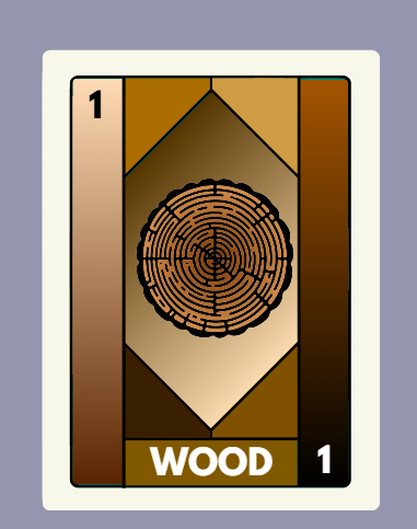
Banners of Kings is a strategic medieval board game for 2–4 players where each player rules a kingdom under siege. Players draw event cards, form alliances, wage wars, and manage resources like wheat, wood, gold, and stone to survive. The goal: outlast your rivals by defending your castle walls while navigating battles, betrayal, and shifting political power. No points, just strategy, survival, and dominance.
The creative process
Banners of Kings started as a simple idea: what if medieval kingdoms clashed not just with armies, but through shifting alliances and unexpected twists? From there, I began sketching mechanics on paper resource management, wall defense, and player interactions.

1. The idea
I’ve always loved board games and dreamed of creating my line one day, but I had no idea where or how to begin. For the longest time, I lacked the spark to get started. Then, one sleepless night, out of nowhere, inspiration struck. As crazy as it sounds, the idea hit me at 3 a.m., and I immediately grabbed my phone to write it down.
I imagined a game that would be fun to play with friends, something that combined teamwork, betrayal, and, of course, epic battles. That late-night spark became the starting point for Banners of Kings.
2. First prototype and testing
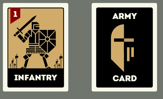
The next morning, I woke up with a clear mission: fix the chaos. I grabbed a clean sheet of paper and began rewriting the rules properly, transferring them from my phone into something more structured. With the rules now solid, I realized I had no cards not even ideas for them. So I started from scratch, brainstorming different card types, their functions, effects, and text. I drafted each one by hand, thinking through the balance and purpose behind every ability. By the end of that same day, I had hand-drawn 180 unique cards, messy, imperfect, but real. The game was starting to come to life.
Once everything was in place ,the game rules, the cards, and the core mechanics. I playtested the first version of Banners of Kings with my girlfriend. As expected, it was total chaos: about 20 different issues surfaced, from unclear instructions to broken mechanics and loopholes. But I didn’t mind. The foundation was there, and that was what mattered. From that point on, I knew I had something worth refining a game with real potential to become both strategic and fun.
3. Iteration of game rules
The next step was to tackle the long list of issues I’d uncovered during the first test round. I went through each problem, one by one, and even anticipated more that could come up later. Once I felt confident, I sat down and properly wrote out the first full version of the game rules…on paper. Not the safest choice, so I quickly created a digital backup… just in case.
Then a new challenge emerged: design. While I had 180 cards, only about 20 had truly unique designs at that point. And as much as I enjoyed my hand-drawn stickman cards, I knew I wanted the game to feel more polished and professional. That kicked off the iterative design phase, a process that ended up taking me over six months. Countless revisions, experiments, and style tests later, I finally landed on a visual identity that brought Banners of Kings to life, but more about that later.
4.What design is going the be used?
started with a classic approach: a simple, realistic fantasy-medieval style. Using Canva on my laptop, I built the first visual concept with three core colors, golden brown borders, a black background, and grayish text. It wasn’t bad, but it felt… forgettable. It looked like every other medieval card game out there, and blending in was the last thing I wanted.
So I decided to bring in a fresh perspective, not from a traditional graphic designer, but from AI. I used ChatGPT not to generate visuals, but to act as a creative consultant. I uploaded alternative design ideas and asked for pros and cons, comparisons, and ways to make the visuals more distinct.
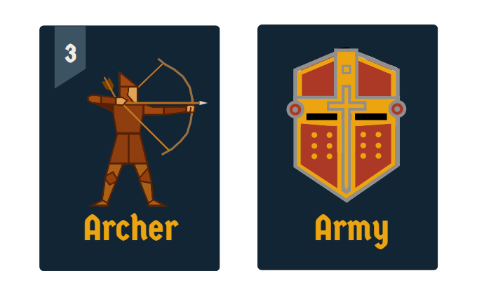
That’s when I made a shift. I moved away from realism and embraced a style I call geometric 2D minimalism. Clean lines, bold shapes, and a modern twist on medieval themes. This direction made the game feel different, and that’s exactly what I was aiming for. Of course, the style would go through more iterations, but that decision became a key turning point in defining the game’s unique identity.

5. Iteration number 2
I spent a long time experimenting testing different formats, shapes, colors, and layouts. Slowly but surely, the graphic style started to take shape. It began to feel cohesive, like the game had a visual identity of its own. But something still felt off. It looked good, but it didn’t feel quite right.
So I made a bold decision: I stripped all the colors away. I went back to black and white and pushed the design toward even deeper minimalism. That reset gave me a fresh perspective. With fewer visual distractions, I could focus purely on structure, clarity, and style. And for the first time, the game’s aesthetic truly aligned with its core: sharp, strategic, and striking.
6. Iteration number 3
Now, I had entered the black-and-white phase of the design process and looking back, I see this as a crucial turning point. For about 1 months, very little changed. I kept refining small details: adjusting banners, tweaking typography, experimenting with layout and subtle touches of color. But overall, the progress was minimal.
And that was okay. This phase was less about making big leaps and more about sitting with the design, letting it breathe, and observing what truly worked. It was a period of quiet iteration, slow, but essential. Where the game’s identity started settling into place with more confidence and clarity.

7. Iteration number 4
This is the part of the journey where things started to slow down. If you thought the previous phase was quiet, this one was almost still. For nearly three months, I felt stuck. The changes I made were minimal, tiny adjustments here and there, and I wasn’t sure what direction to take next. Truth be told, this design style nearly made it to the finish line. It was so close to being final, even ready to print.
But then a technical problem stopped me. I had found a print-on-demand company I was ready to use, but their card template had different edge measurements than mine. My design included a white border around each card, but their specs didn’t support it properly. So I had to scrap that element, a small detail, but one that forced me to rethink the overall presentation. That roadblock, frustrating as it was, ended up being another moment of growth.
8. Iteration number 5
I decided to simplify once again ,going back to a fully black background and embracing black and white for the time being. I’ve learned that when you feel creatively stuck, stripping things back to the basics can give you a fresh perspective. It helped me take a step back, reevaluate, and see the design with clearer eyes.
At this point, I also made adjustments to the card designs to bring more consistency across the entire set. Subtle but important changes made the visual language feel more unified. Around the same time, I refined the rules and adjusted the total card count, all with one goal in mind: preparing the game for its first real, printable version.

9. Iteration number 6
And finally, I reached the last stage of the design process. It took six months, countless iterations, and a lot of trial and error, but I got there. Around this time, I also started taking design courses to strengthen my skills and apply what I was learning directly to the game. This brought a fresh layer of intention and clarity to the visual direction. Also some other changes where made with some Cards to fully align them all in the same design style.
I decided to move forward with a consistent color scheme: a deep blue background paired with contrasting colors for the card elements. This kept the design clean, readable, and visually striking, while still maintaining the minimalistic style I had developed throughout the journey. With the rules locked in and the card count finalized, Banners of Kings was finally ready for its first professional print.
10. Adjustment of final game rules + next steps
I ordered the first printable version of Banners of Kings, it took time, but it finally arrived. Holding the physical game was a moment of pride and validation. I playtested it right away and, of course, found a few small issues: minor clarity problems and some mechanics that needed fine-tuning. Now, the next step is to refine those final details and prepare the game for its first Kickstarter launch. After months of work, the vision is almost ready to be shared with the world.